


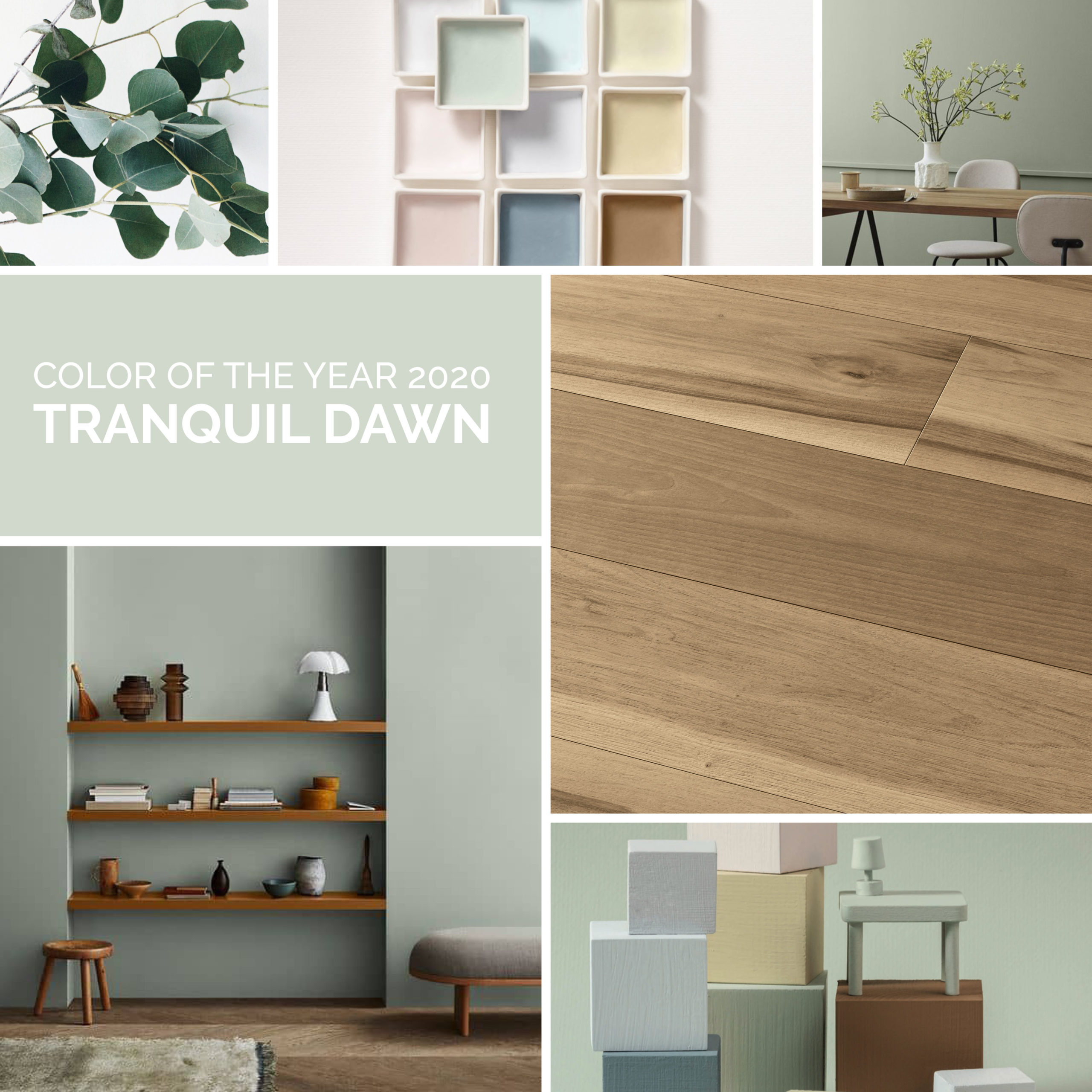
Yes, the end of the year is approaching, and after what we have lived through worldwide, it’s good news. There is a desire to definitively turn over a new page, and there is no better moment than the start of a new year to begin thinking positively again. It is also the perfect time for believing in new serenity, starting again, and finding hope again. This idea can be perfectly described by two words, the name of a colour in fact: Tranquil Dawn.
According to the specialists from AkzoNobel’s Global Aesthetic Center, this is the colour of the decade that began in 2020. A light and relaxing green, with delicate grey and blue highlights, inspired by the short-lived sky that has just been surprised by the dawn. It is a versatile colour, suitable for all rooms in the home. It is full of personality but cultured, so it never tires. In a world that is ever more frenetic and virtual, Tranquil Dawn is the answer to the question that started our team’s research: what makes us human beings today?
Our combination: Genesi parquet
There is only one perfect combination: with parquet. Tranquillity, in fact, is a game of sensorial vibrations that reverberate from the surfaces to the furnishings, and from the furnishings to the floor as a unique experience of calmness and relaxation. And there is nothing more relaxing than the naturalness of wood to make this moment of total interior wellbeing more intense and longer-lasting.
Our choice could only be Genesi, the Corà parquet which is processed in a manner that exalts the visual and tactile effect of freshly-cut wood, that moment when it is most alive.
An alternative? All the proposals from the Corà Evo Garant line, treated with totally natural and safe varnishes, for a space where tranquillity is no longer just a question of colour, but also of the light and aroma of a new way of feeling at home.
It goes well with every colour
As already mentioned, Tranquil Dawn is a colour for every environment that wants to transmit serenity. This is why it has no limits when dressing any room in your home. In more modern living areas it combines perfectly with the visual effects of metallic materials, a play of contrast that calls back to nature, or in harmony with wood-coloured furnishings.
In revisited classic spaces it breaks the repetition of tone on tone, but without hazards. It can be the main colour in kitchens, bathrooms or bedrooms, perfect for furniture or components that want to light up surfaces by playing on contrasts or, vice versa, it can be a calming background, dampening down richer, more brightly-coloured elements.
Its most interesting trait? It gets along well with palettes that are completely different, combining with any chromatic mood you want for your home. It fills the brightest spicy colours, from ochre to sage, from light dusty pink to blue whale with energy. It brings wellbeing and positivity to sand and pastel colours, is magical when close to wood. It stays calm in minimalist environments with tones that range from powder to ice. It expresses itself well with the most playful and lively tones, from candy pink to canary yellow, even intense black. They all make sense together thanks to Tranquil Dawn.