It is called Viva Magenta, and it is a true… incentive to fill homes with liveliness and character. We are naturally talking about Pantone for 2023, indicated by the Pantone Color Institute as the colour trend that will accompany us through the next 12 months.
The study centre of the historical American company, which dictates law globally when speaking about colour standards, has no doubts. After last year’s calming “Very Peri” blue, it is now the turn of this bold, expressive red to steal the spotlight.
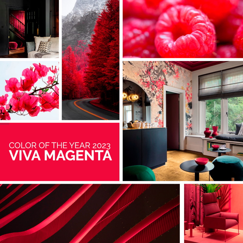
A type of crimson with a shade of carmine that softens towards intense raspberry. A “fist in a velvet glove”, as Leatrice Eiseman, the executive director of the Institute describes it, because of its ability to dominate with an elegant, assertive approach that is animated but not aggressive.
Its vigour, in fact, is enclosed in a hybrid tone. And just to start off, it cannot be classified as warm or cold. It remains comfortable in any type of atmosphere, spreading refined exuberance and joyous optimism.
What colours to combine with Viva Magenta
Viva Magenta is a red that transforms design, giving a completely different light to spaces according to the colour it is paired with. Without excluding anything, given that in the right doses and with the right nuances it suits practically everything. The important thing is to choose the effect that is to be transmitted. In general, its positive energy communicates elegance when paired with white, grey or blue. With pastel colours its brilliance lights up even more. And to guide the choice of those who design or live homes, the Pantone 2023 colour of the year comes in 4 distinct palettes:
Ignite
Combined with a selection of pastel tones, from pink to light blue, passing through imperceptible tones of khaki. Each one can intensify the brightness of viva magenta even more


Equilibrium
A bit more daring, going beyond the name: a triumph of warm colours, from orange to pink, from pink to grey. Because in the end, the balance lies in the common energy that these tones transmit when they are combined.
Family Ties
The colours in this palette are very similar to Viva Magenta because from the same family. A series of nuances from pink to coral to brown, for those who appreciate tone-on-tone combinations that always impress.


Resonance
The darkest palette, from green to polar blue. A variety of very different tones that brighten up when combined with Viva Magenta.
How to furnish with Viva Magenta
The perfect colour for filling spaces where people can meet, share, be creative in homes. Indoor furnishings and designs that use Viva Magenta red are a good solution for just about anywhere, because the colour is easy to apply and amazes at first sight.
According to the Pantone color designers it is perfect for fabrics, which can be used for curtains, rugs or cushions to create a spectacular impact in homes, and for all elements with polished surfaces that reflect, like vases, glasses and glasswork in general. Different from the “usual, old red”, which becomes depressive and tiring after a while, Viva Magenta can be the right choice for people who want to dare with their kitchen furnishings.
And for the most daring, it can stun even on walls, giving the right touch of colour without ever going over the top.
Viva Magenta and parquet, lose yourself in the hues of the Greek beaches
Simply intense like the colours of summer, but also vibrant with creativity and elegant experimentation. Viva Magenta is the perfect bridge between nature and its quintessence, and the most sought-after atmospheres of glam spaces.
This being the case, combining it with wood virtually becomes the most obvious choice. Starting certainly with parquet, but not just any. We recommend European durmast oak, selected rigorously with processing that can maintain the play of effects that release the energy of this colour.
Our proposal is Plancia 3 Strati from the Easy collection (see it on our Website).
Brushed to make the texture of the wood even more authentic, it is truly a covering to be appreciated in the Mykonos, Kos and Santorini finishes, which with Viva Magenta seem perfect to evoke the Greek landscapes.
Become enraptured by the image of a picturesque beach with warm hues, a red sunset, and a sea of bougainvillea.